Coop Soft drink
Background: Coop’s inhouse design department has developed a successful private label that reaches from milk to shampoo.
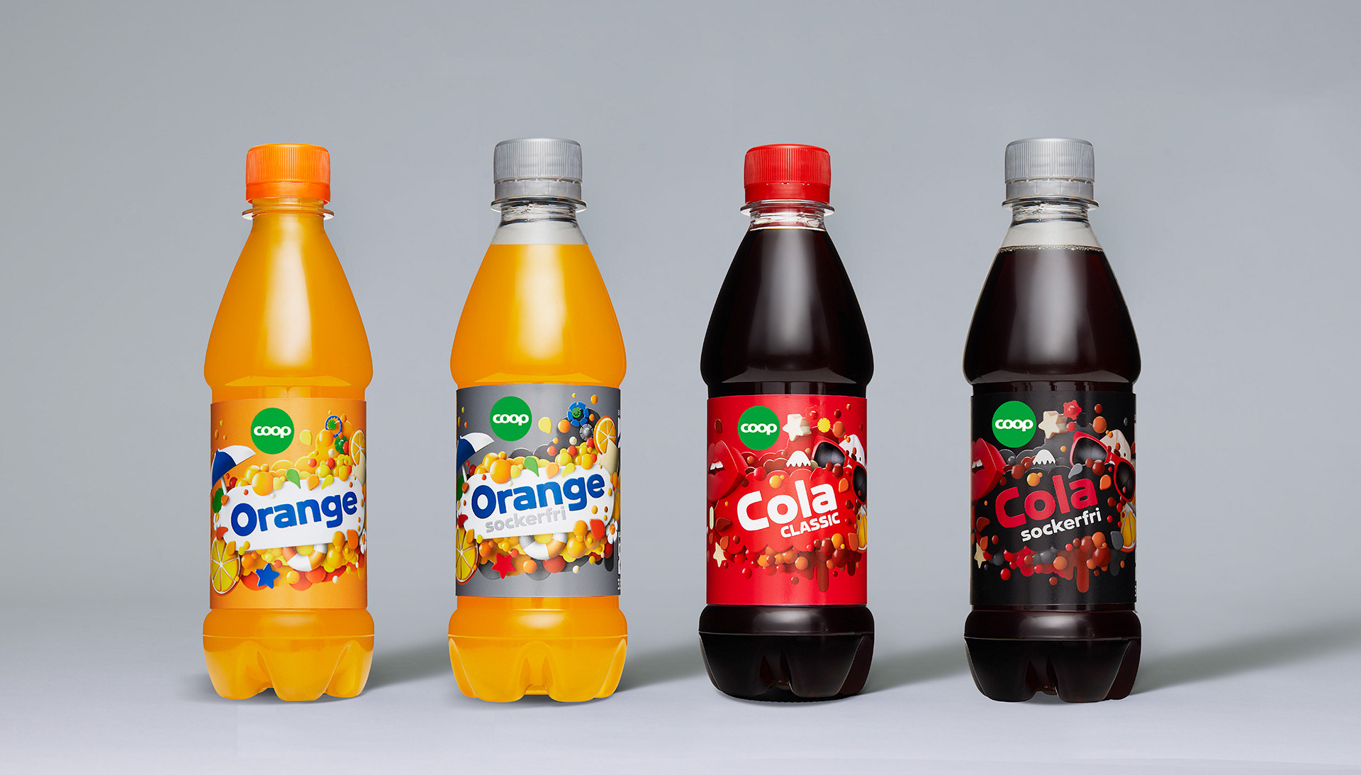
Brief: To assist Coops inhouse department to create products within the soft drink department which is a complement to well known, established brands. The Consumer should know exactly what kind of drink they are buying. The design should follow the Coop guidelines and the design should at the same time be as attractive as the established brands.
Solution: The Coop typography which is very blocky, was mandatory. To make it work visually, we needed to create objects which was as blocky as the typography. We created emoji-inspired elements in 3D in the same colour palette as the established brands, creating soft drinks that was attractive, modern and had a great standout. Credits: Cécile Hallberg, illustrator, www.chgraphiste.com. Co-creative: Jonas Malmquist, Coop Egna Varumärken Design