Ingrosso Selection
Background:Brief:
Solution:
Ingrosso is one of the most recognizable surnames in Swedish pop and food culture. With deep Italian roots, the family is synonymous with high-quality Italian cuisine, largely thanks to Emilio and Åsa Ingrosso’s acclaimed restaurant empire in Sweden – and their flagship location in Palma, Mallorca. The next generation of the family, including their sons, continues the tradition through their own restaurants and cooking shows.
Building on this legacy, Åsa and Emilio wanted to create a line of wines that proudly carries the family name – to be served in their restaurants and offered via Systembolaget, giving people the chance to enjoy their own Ingrosso moment at home.
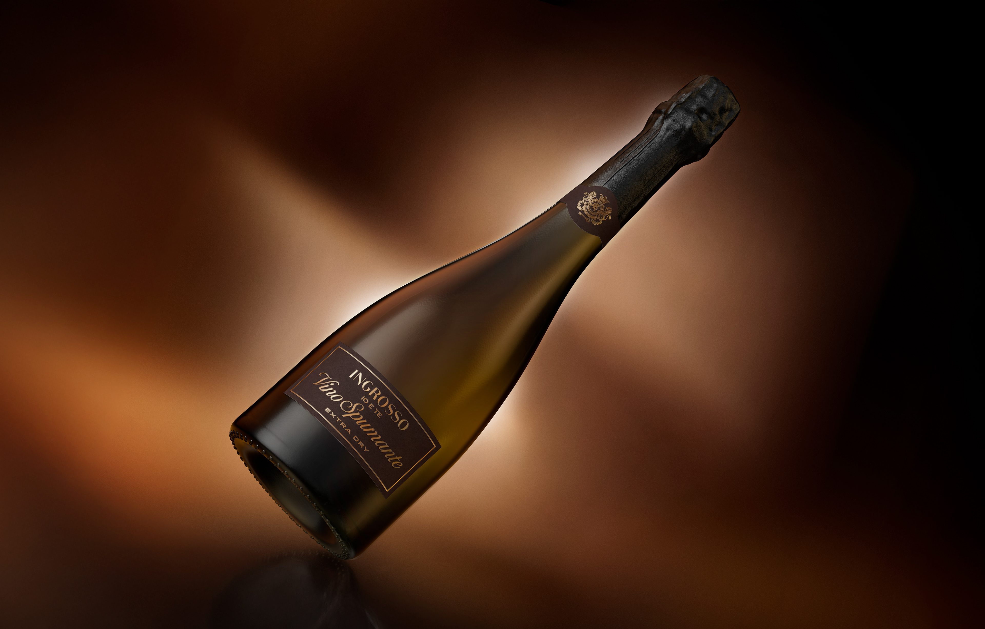
Create a visual identity and packaging design for a wine series that clearly communicates the Ingrosso name and heritage – standing out both on shelves and in communication. The design should feel like a natural extension of the restaurants’ atmosphere: stylish, timeless, and rooted in Italian elegance. The identity should also be flexible enough to work beyond the wine bottle, across various brand touchpoints.
Solution:
The first wine in the series was a Spumante, carefully selected for its unique blend of three grape varieties – Glera, Chardonnay, and Pinot Grigio. This combination results in a drier, more refined profile compared to the more commonly known Italian Prosecco, which is made exclusively from Glera grapes.
To ensure strong recognition and consistency, we developed a family crest – a symbol of pride and authenticity – that could be used across packaging, menus, signage, and more. The label design channels the understated elegance of classic Italian aesthetics, with refined typography, subtle detailing, and a focus on balance and clarity. Together, these elements form a cohesive identity that both honors the Ingrosso legacy and delivers on the promise of quality – whether enjoyed at the restaurant or around the dinner table at home.